In the last couple months I've gotten a couple questions about how I take pictures of my miniatures. For me, learning about miniature photography has been one of the best things about starting this website and participating in our hobby's online community. In my view, shooting miniatures is as creative an act as painting miniatures, with some hobbyists transforming it into a veritable art form. Some of my favourites include:
- Allison M. at The Painting Agency. Although capable of clean photos with simple backgrounds, Allison also produces stunning dioramas with dramatic backdrops -- these pics really heighten the senses of adventure that's such a big part of his miniatures.
- Orlygg at Realm of Chaos 80's. The grand-daddy of Oldhammer has self consciously emulated the staging of the miniature photography in Warhammer 3rd edition: lots of depth, lots of detail and lots of reindeer moss! It's like he's got a time machine going right back to 1985.
- Carlos at Oldhammer Spain also conjures up the authentic Oldhammer feeling with beautiful mini-dioramas. But Carlos has perfected the close-up, allowing us to appreciate an amazing amount of detail on each miniature.
- Private W. at The Privates Eternal. He is the undisputed master of combining wargames, natural light and natural scenery. His backyard seems like Wonderland to me.
- And then there's Barks at Wargaming with Barks. His comic-book style elevates miniature photography/battle reporting to a new level of pop art. I could stare at his work for hours.
I -- of course -- have a different approach to any of these gentlemen...
And I guess that's the first part of miniature photography: you have to decide what you mean to accomplish. Although I experimented early on with photos that place my miniatures in the context of the games, I realized that what I really wanted was a clean, distinctive and uncluttered look for my photos. I wanted something that mirrored a clean, distinctive and uncluttered blog. My aim is to make the miniature (and the paint job) as "readable" as possible. In this sense, I'm similar (if inferior) to artists like Stro'knor at Quindias Studios or Jinnai at the Realm of Jinnai. Like them, I focus my photography on the miniature itself, not on the flavour of the underlying game.
 |
| The Ghoul (1985) from the Talisman Range, sculpted by Aly Morrison |
Well, enough about philosophy - let's discuss practicalities. The number one requirement for miniature photography isn't the camera, or the background. You need light. Lots and lots of light. Natural light (outdoors on a slightly overcast day) can produced marvelous effect. I still remember a magic day when I took a series of photos in my backyard of my Wild West town. However, because I wanted more consistency and reliability in my photos, I ultimately opted for indoor photography using a light box. I won't dwell too long on this topic because I've already written about the Foldio Light Box that I use for my shots. Almost 2 years on, I'm still happy with it, although I'm looking forward to the arrival of the new (and larger) model, which will help me take photos of bigger units and "360 degree images".
I also use a Flotone Blue Jay graduated photographic background on all my shots. These backgrounds are huge, poster sized sheets, so obviously you have to cut them up to fit inside your light box. I've also written about this fantastic product, and I will just emphasize that it's incredible how the colour of the background alters the appearance of the miniature. If my miniatures seem brightly coloured (or if they seem to have a strong cel-shaded look), I think at least part of the praise/blame can be laid at the feet of all my lights working in conjunction with the Flotone.
I don't own a camera. All I've ever used is my Samsung Galaxy s. 4 smartphone. So I don't think an expensive camera is necessary. But I have given a terrible amount of time to thinking about tripods, experimenting with half-a-dozen before settling on this cheap tripod and bluetooth shutter control purchased on eBay. The tripod is all important because the position of your camera changes the perception of your miniature.
I like very close shots, which Smartphones pull off with alarming ability. Usually, only about 1-3 inches separate the miniature from the lens. The positive side of close-ups is that you attain a very high resolution to your images. This captures a lot of detail on the figure, right down to individual brush strokes. But there are several downsides: very small flaws in the painting a glaringly obvious. Even specks of dust that are invisible to the naked eye flare on the miniature like stars emerging from the evening sky. And finally, when your lens is that close to the miniature, you have an extremely narrow depth of field (i.e. you have a narrow band where things will be in focus). This means that if a particular miniature is throwing one hand behind him, that hand may not be as sharply in focus as the miniature's face because of the difference in their distance from the lens.
Of course, sometimes a narrow depth of field can produce dramatic effects, like in this photo of my orc baggage train:
I spend a lot of time thinking about how to position the camera. If you want your miniature to look like it will on the gaming table, it's best to shoot them from a higher angle, since this is how the players see them. Personally, I want the viewers to see my miniatures as I see them while I paint them, so I shoot them at a low angle. I also think this adds a sense of life to the miniature, since this is the perspective at which we all view each other in the real world.
For some miniatures, I angle the camera almost below level to make them seem more threatening or heroic, like this shot of Han Solo:
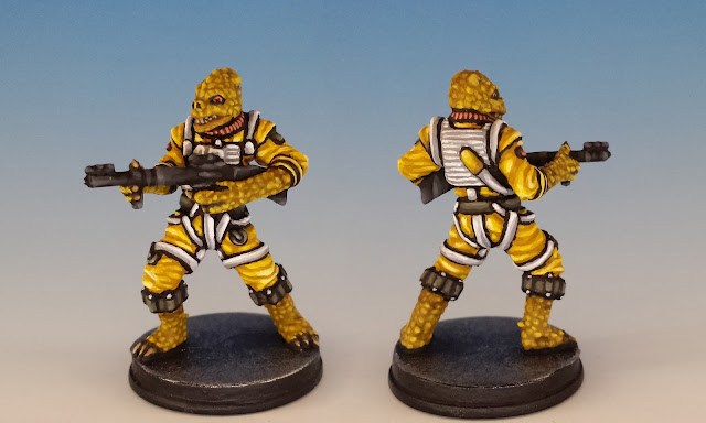
And then there is post-production. In order to achieve a clean, uniform look, I generally crop my photos to a 3x5 ratio. For many shots, I use Photoshop's Photomerge Panorama function to give both the front and back of a miniature in one frame -- this is part of my quest for a highly readable image that other hobbyists can use as a reference tool for their own work. (It took dozens and dozens of hours to create these duplex images when I assembled my galleries of all the Talisman miniatures, so I hope you lot appreciated it!)
And then there is post-production. In order to achieve a clean, uniform look, I generally crop my photos to a 3x5 ratio. For many shots, I use Photoshop's Photomerge Panorama function to give both the front and back of a miniature in one frame -- this is part of my quest for a highly readable image that other hobbyists can use as a reference tool for their own work. (It took dozens and dozens of hours to create these duplex images when I assembled my galleries of all the Talisman miniatures, so I hope you lot appreciated it!)
For the sake of maintaining a high resolution, it's generally a good idea to let the miniature fill as much of the image as possible. Sometimes however, it can be fun to play with composition. Every once in a while, I enjoy expanding the negative space in the frame in order to accentuate the silhouette of a particularly dynamic miniature. For example, here's Han again, spinning to shoot at someone that the viewer can't see:
So that's how Oldhammer in Toronto does it. Please share your own photo tips, or feel free to ask any questions in the comments. Cheers!
So that's how Oldhammer in Toronto does it. Please share your own photo tips, or feel free to ask any questions in the comments. Cheers!


